
What does GLM mean?
GLM stands for Generalized Linear Models. These statistical models are used when one wants to predict a variable using known functions of the predictor variables. Under these conditions, GLM are a powerful statistical tool used by researchers throughout the world.
Example: Annual income increase
Let’s explore an example for a salary that increases every year and let’s predict future salaries.
# creating income date from 2010 to 2020
year = 2010:2020
# crating a base salary, which begins with 1000 and increases 100 yearly. In other words, we are supposing that the income increases 100 yearly.
income.base = seq(1000, # start salary
                   length.out = length(year), # vector size
                     by = 100) # yearly increase

# Let's define an income deviation, which will be added to the income base to obtain the real income. That is, we only know the real income; we do not know the base income that increases 100 yearly and we wish to find out this 100 yearly increase.
set.seed(2) # defining a seed so that we can repeat this simulation
income.deviation = rnorm(length(year),
                        sd = 50) # standard deviation for the income deviation

income.real = income.base + income.deviation

# let's plot the data and see how it looks
plot(year, # x
     income.base, # y
     type = 'l', # plot line
     xlab = "Year", # x axis name
     ylab = "Income", # y axis name
     lwd = 10, # line thickness
     mgp=c(2.3,0.7,0), # change the position of texts and axes
     cex.lab = 1.4, # increase size of text of the axes
     cex.axis = 1.4) # increase size of numbers in axes
grid() # create grid lines

lines(year, # x
      income.base, # y
      lwd = 10) # line thickness

points(year, # x
       income.real, # y
       cex = 2, # point size
       pch = 16, # point type
       col = "red") # point color

# creating legend
legend('topleft', # legend position
       c("Real", "Measured"), # legend text
       lwd = 7, # line thickness in legend
       lty = c(1, 0), # line type in legend
       col = c('black', 'red'), # line color in legend
       pch = c(-1, 16), # point type in legend
       cex = 2) # increase legend size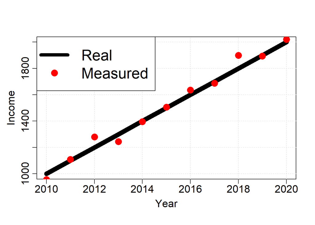
Now that we have the dataset, we can train our GLM model. As the model we will train is simple, we will use the lm function in R.
# training the GLM model
model.GLM = lm (income.real # what we want to predict
                 ~ # prediction formula comes after ~
                   year) # what we will use to predict

# let's look at the summary of the model
summary(model.GLM)
##
## Call:
## lm(formula = income.real ~ year)
##
## Residuals:
##    Min     1Q Median     3Q    Max
## -59.80 -33.28 -11.15  16.99  80.22
##
## Coefficients:
##               Estimate Std. Error t value Pr(>|t|)
## (Intercept) -2.083e+05  9.073e+03  -22.95 2.68e-09 ***
## year         1.041e+02  4.503e+00   23.12 2.52e-09 ***
## ---
## Signif. codes:  0 '***' 0.001 '**' 0.01 '*' 0.05 '.' 0.1 ' ' 1
##
## Residual standard error: 47.22 on 9 degrees of freedom
## Multiple R-squared:  0.9834, Adjusted R-squared:  0.9816
## F-statistic: 534.6 on 1 and 9 DF,  p-value: 2.517e-09

# the model found an annual increase of 104 +- 4, which inclues the 100 yearly increase of the base income

# let's plot the model and compare the GLM function

income.estimated = predict(model.GLM, data.frame(year = year))

plot(year, # x
     income.base, # y
     type = 'l', # plot line
     xlab = "Year", # x axis name
     ylab = "Income", # y axis name
     lwd = 10, # line thickness
     mgp=c(2.3,0.7,0), # change position of axes texts
     cex.lab = 1.4, # increase axes text
     cex.axis = 1.4) # increase number of axes
grid() # create grid lines

lines(year, # x
      income.base, # y
      lwd = 10) # line thickness

lines(year, # x
       income.estimated, # y
       lwd = 4, # line thickness
       lty = 2, # line type
       col = "red") # line color

# creating a legend
legend('topleft', # legend position
       c("Real", "Estimated"), # legend text
       lwd = 7, # legend line thickness
       lty = c(1, 2), # legend line type
       col = c('black', 'red'), # legend line color
       cex = 2) # increase legend size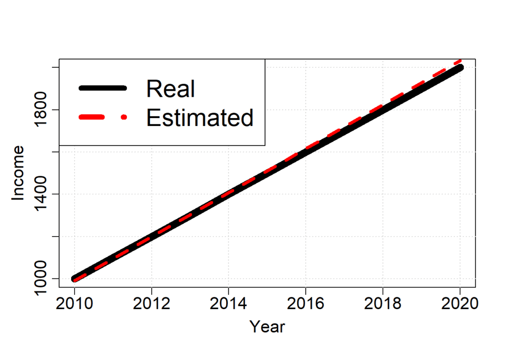
to predict future salary, we can plot the estimated income with a 95% confidence interval.
years.future = 2010:2030
income.predicted = predict(model.GLM, data.frame(year = years.future), interval = "prediction")

plot(years.future, # x
     income.predicted[,1], # y
     type = 'l', # plot line
     xlab = "Year", # x axis name
     ylab = "Income", # y axis name
     lwd = 10, # line thickness
     mgp=c(2.3,0.7,0), # change position of axes texts
     cex.lab = 1.4, # increase axes text
     cex.axis = 1.4) # increase number of axes
grid() # create grid lines

lines(years.future, # x
      income.predicted[,1], # y
      lwd = 10) # line thickness


# lower confidence interval
lines(years.future, # x
       income.predicted[,2], # y
       lwd = 4, # line thickness
       lty = 2, # line type
       col = "red") # line color


# upper confidence interval
lines(years.future, # x
       income.predicted[,3], # y
       lwd = 4, # line thickness
       lty = 2, # line type
       col = "red") # line color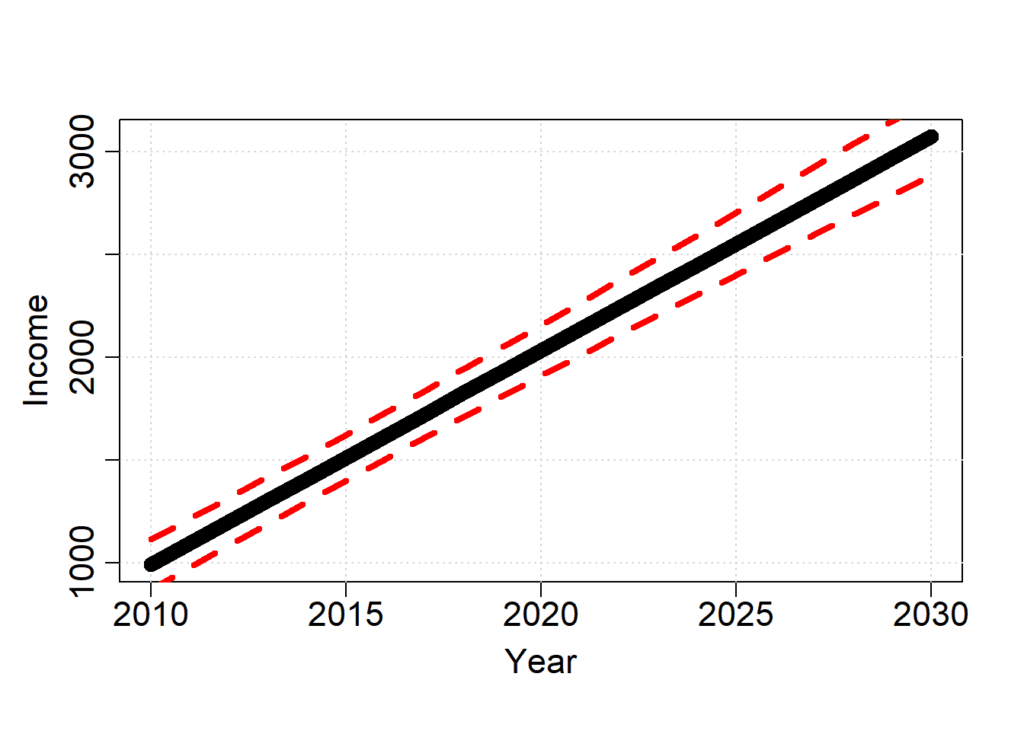
Where can I go to learn more?
I recommend the following literature:
- Book that introduces several statistical techniques in the R environment . Zuur AF, Ieno EN, Walker NJ, Saveliev AA, Smith GM. Mixed Effects Models and Extensions in Ecology with R. Springer, New York, 2009.
- Book that discusses GLM theory in R. Pinheiro JC, Bates DM. Mixed-effects models in S and S-PLUS. Springer, New York, 2000.